
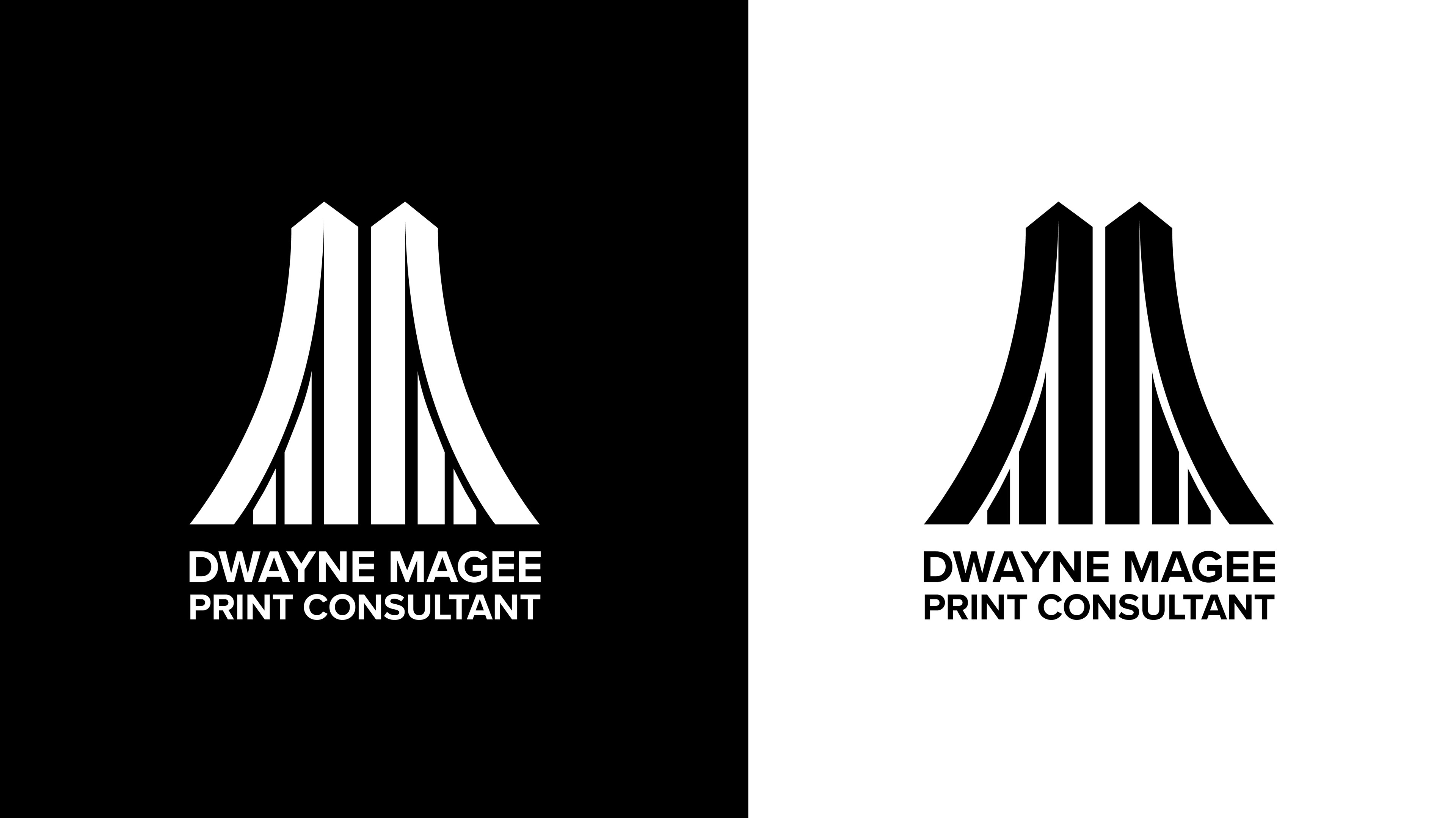
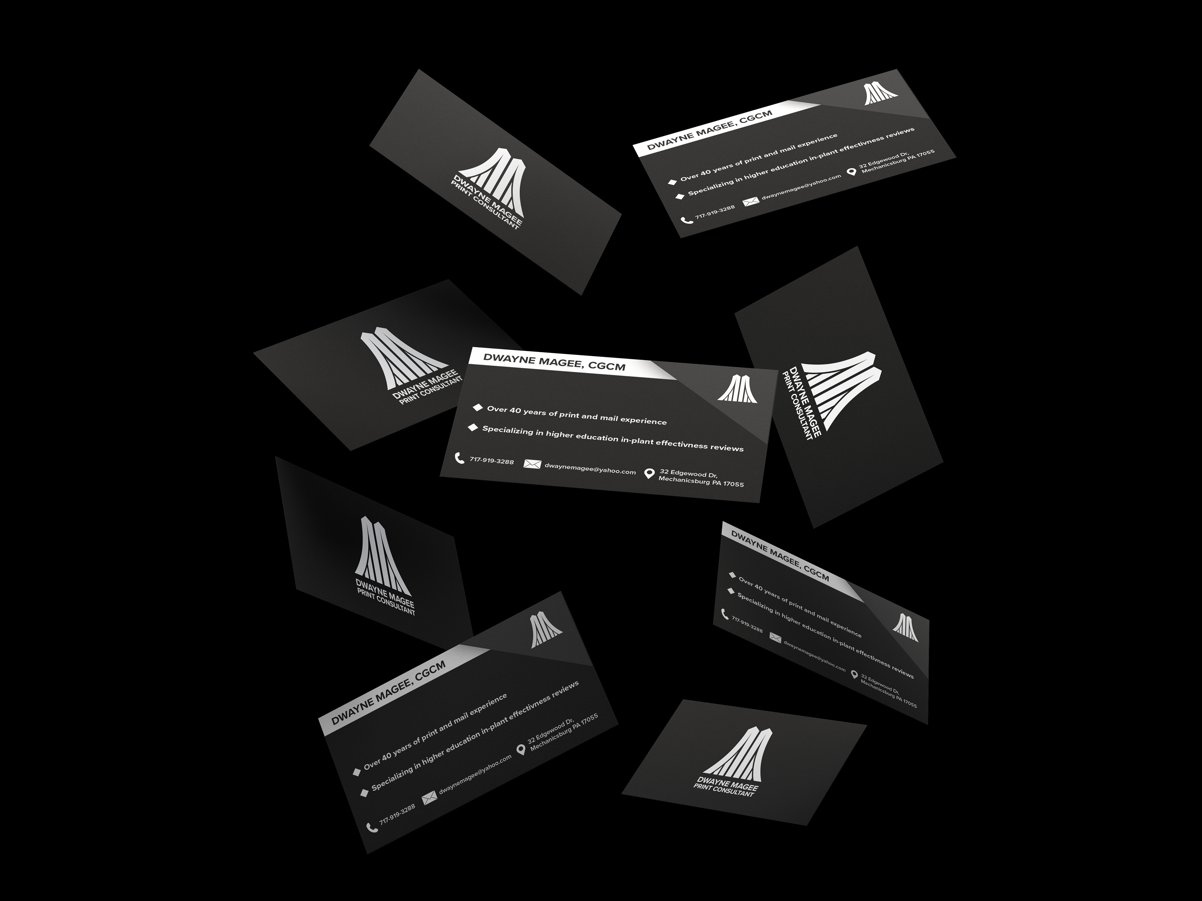
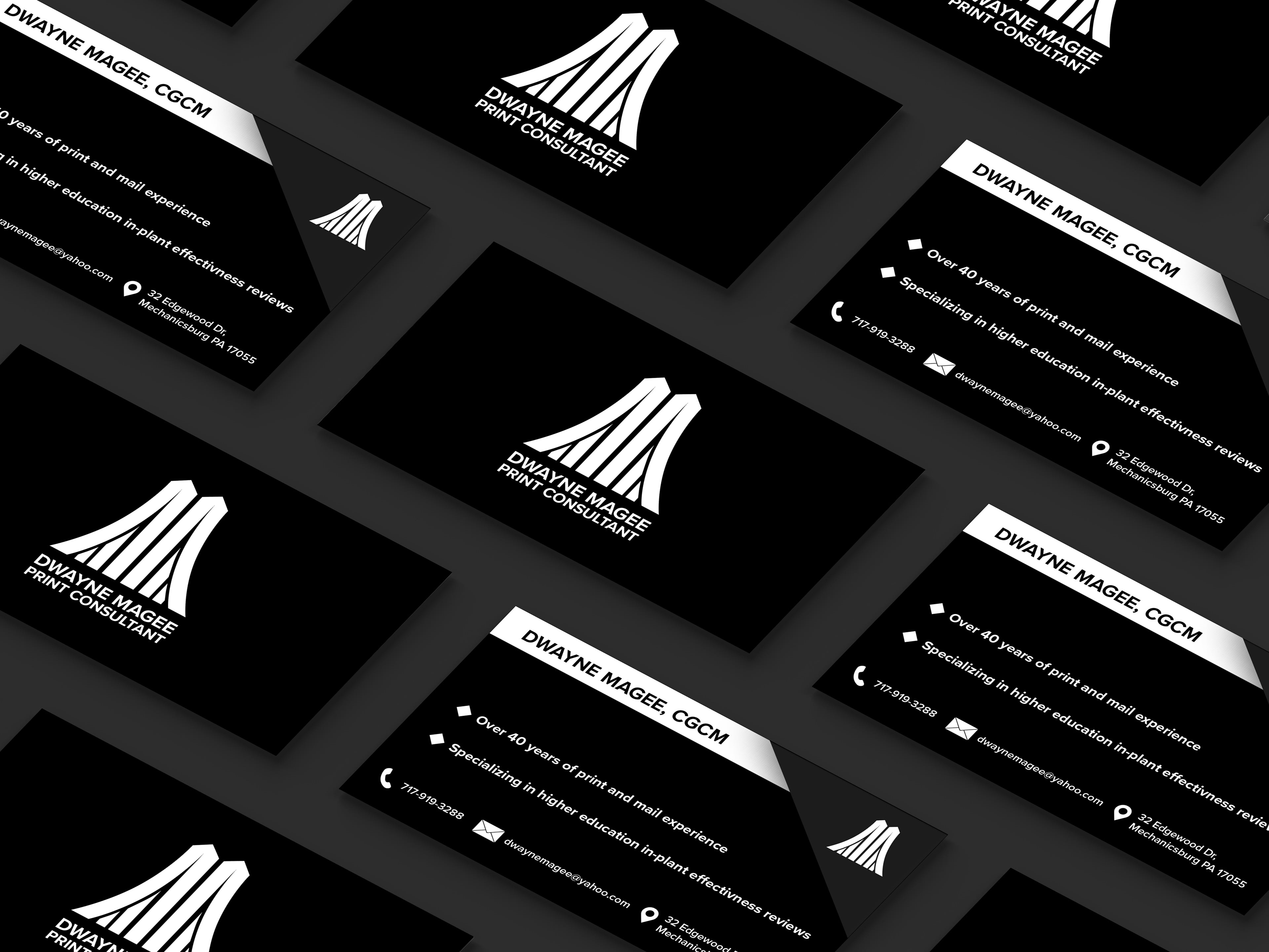
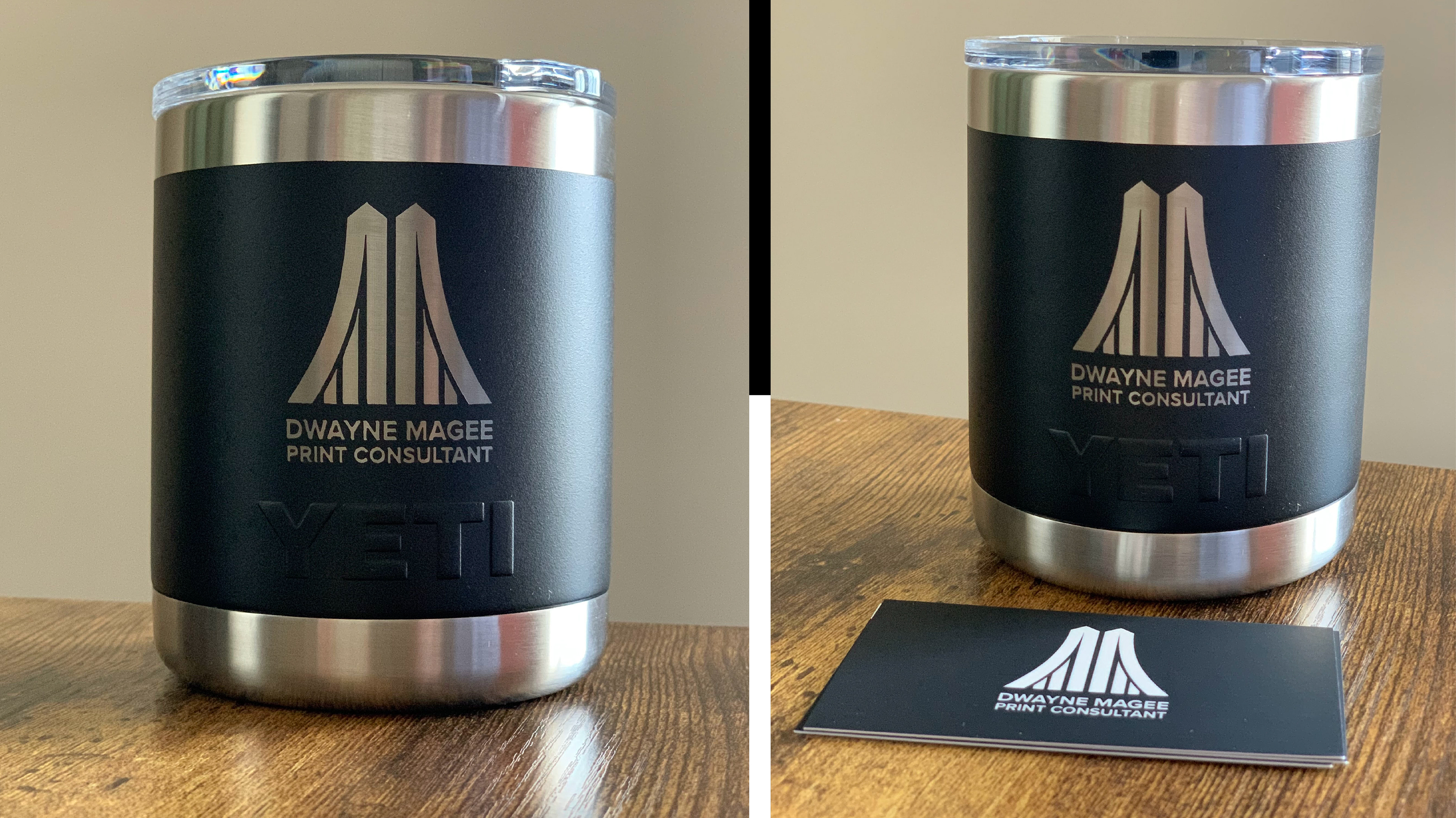

I created this logo for my dad’s print consulting business. He conveyed to me that he wanted his business to feel like a bridge that transported clients from where they currently are to where they would like to be. Using this concept, I based the logo design on the Brooklyn Bridge. The “M” in the logo is similar to the archway on the bridge to portray his business as the gateway for client success.